

Taffel’s website was out of date and lacked responsivity to modern mobile devices. It also needed a social media share for a possible customer to link their favorite product to their peers. Recommending related products was also missing.
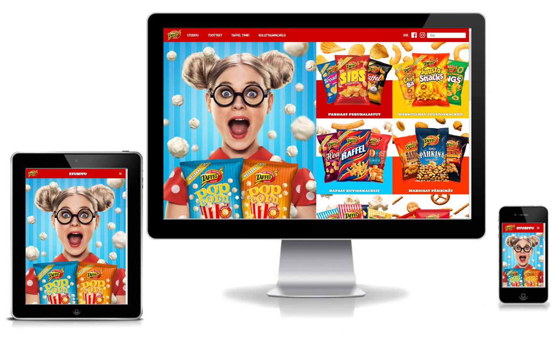

A mobile first website that looked good and would fill the future needs of campaigns and new products launches and easy to update with new products. Technically compatible scalable layout with existing product library management system that could be updated from one place and it would also automatically update the new products to the site.
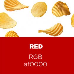
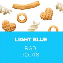
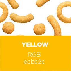
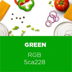
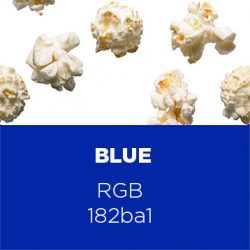
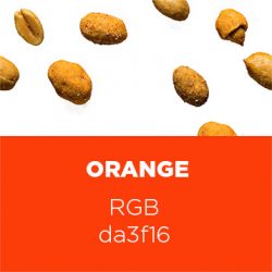
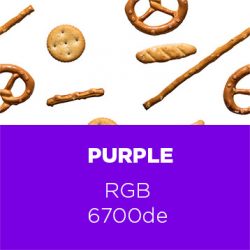
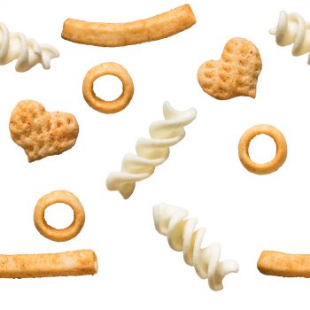
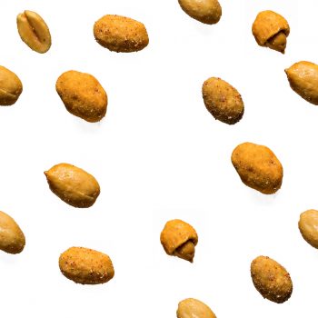
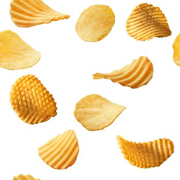
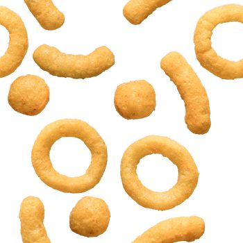
Site should feel fresh in colours and in layout and be in line with brands existing visual look & feel so I came up with this half and half element, which had upperside the category identifier image that would form a pattern if placed side by side. Lower half would be strong popping compact color so text would be readable and image of the product would be clearly represented.
Key elements what this informational page needed was a navigation to products, category identifiers, a filter and a search for product allergens and special diet information. As a plus to the product info page was a recommended section to check out compatible or suggested products.
In front page there was a need for contemporary info about campaigns, and at that time a square form of images was most accepted in instagram, facebook and other social media so any campaign that would be made it would fit with no extra effort to the front page.
Site should feel fresh in colours and in layout and be in line with brands existing visual look & feel so I came up with this half and half element, which had upperside the category identifier image that would form a pattern if placed side by side. Lower half would be strong popping compact color so text would be readable and image of the product would be clearly represented.

MOBILE
Responsive layout works in mobile very nicely and all information is just a few clicks away. First user sees whole screen sized campaign that is on and just a slight scroll away is the prodcut categories with their identifiers. If user is determined to find some certain product it can be searched straight from the top navigation menu trough clicking categories or just by typing product name into ther search field.

POTATO CHIPS
PATTERN SNACKS
CHEESY SNACKS
DIPS
POPCORNS
NUTS
OTHER CRISPY SNACKS


Potato chips

Cheese snacks

Shape snacks

Dipping sauce

Nuts

Popcorn

Other snacks
Lactose free /
Low lactose

Gluten free

Soy
Mustard

Celery

Egg

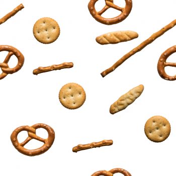
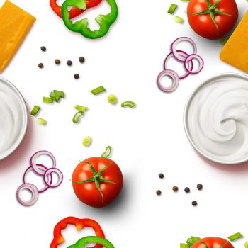
I designed the backround images to form a continuing pattern. For this we arranged a photoshoot to get all the necessary products with a detachable background for pattern arrangement.
TYPOGRAPHY
